This is the Metadyne Website
Information Design Aspects of the London Underground Diagram
London’s Underground Diagram
Information Design Aspects
It’s called the Underground Map. This is, of course, not only quite wrong (it is not a map, it is a diagram) but the whole point is that it has shed its map-like geographical features because a diagram is considered easier to use.
The London Underground Diagram was never designed. It is the product both of a small number of major design changes imposed upon once-indifferent mapping origins, and a constant stream of evolutionary changes not all of which have been successful (many — but not all — of the less successful changes have been discarded, and perhaps some of the better ones too).
The lack of clear design criteria for the diagram may be responsible for otherwise inexplicable changes, especially with modern purchasing practices working against consistency of input by the design houses that are physically responsible for the changes made.
The author suggests that there are several developmental stages, each of which is set out. This starts off with the need to show lines that interchange, then to clarify the distinction between different lines, then to codify the symbols so that the design hangs together as a whole, then finally to reorganize the lines in the form of a diagram. Whether the simplicity sought in the 1920s and 1930s has carried through altogether successfully into an age when the system is hugely larger today I will leave readers to judge.
Download Article
To download the article, please click the button below. Please give the above download several seconds to arrive as it is a large-ish file. If you experience a problem using the button, there is an alternative link at the bottom of the column.
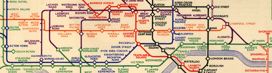
The map extract at the top.
This is part of Henry Beck’s first published diagrammatic map, issued January 1933. Looked at
objectively, it is a strange affair and shows evidence that a number of complex informational issues had
not yet been thought through. For example the line between Turnham Green and Barons Court is not very
happy, in particular station naming problems caused by the lines being horizontal and station names
being quite long. The station names in the central part of the diagram are in fact so cluttered that
ambiguity is only avoided because of the colour differentiation (an approach used on the earlier maps
for the same reason). The station at Earls Court breaks a later rule that a line must never be taken
through a ‘double’ interchange symbol and we don’t know whether the up-down District Route
is separate from the left-right route, or can trains turn left or right?
The Metropolitan was not part of the Underground Group, so its colour (with no explanation) is
distinguished purely on basis of property ownership and not train service pattern (similarly East London
Line). For example trains of either company can pass through High Street Kensington whereas at the
precisely similar depiction at Addison road all trains from either direction will terminate. The
showing of Turnham Green and Edgware Road (both lines) as interchanges is interesting (not done now, but
why not Latimer Road?). Showing Lancaster Gate as an interchange is a reasonable feature not followed
now. What, exactly, is Warren Street interchanging with?
Links
Click below for links to other sites relevant to the points being made here that might be of interest.
Tube Map Central - An Underground Map Miscellany by Dr Max Roberts